When listeners enter your mobile app, the first thing they notice is the splash screen while the app is loading. It might catch their attention for only a few seconds, but it’s one of the core factors in their decision to keep using the app or delete it. An attractive and well-designed splash screen can set the tone for a positive user experience right from the start. To help you create an eye-catching and effective splash screen, we’ve put together a list of five essential tips that will enhance the look and feel of your app’s first impression.
Design Within the Safe Zone
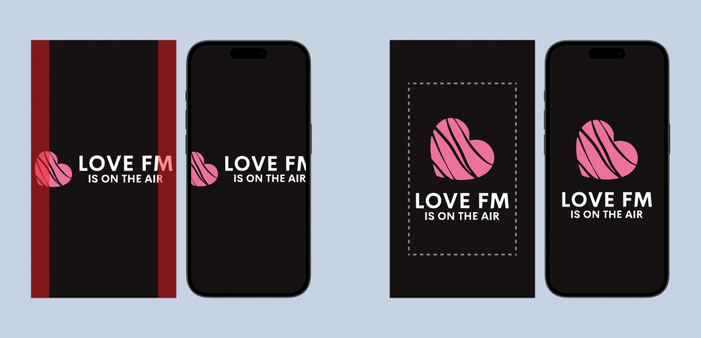
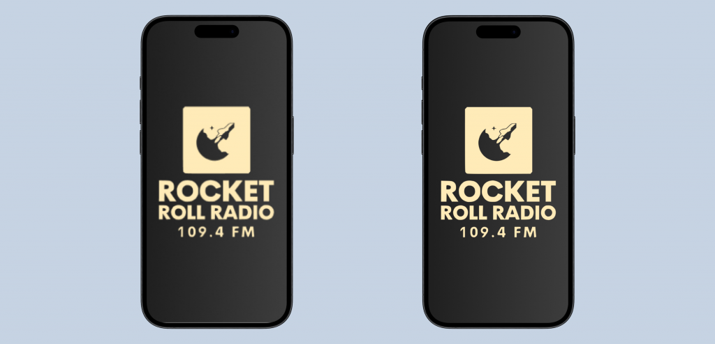
Ensuring your splash screen looks great on all devices means designing within the designated “safe zones.” This helps maintain the integrity of your design across various screen sizes and orientations. Instead of stretching your logo to the edges, organize your logo elements within the Safe Zone box. This approach ensures that your splash screen is easy to view on various Android and iOS devices, providing a consistent and professional appearance no matter the device your audience is using.
Make It Vertical
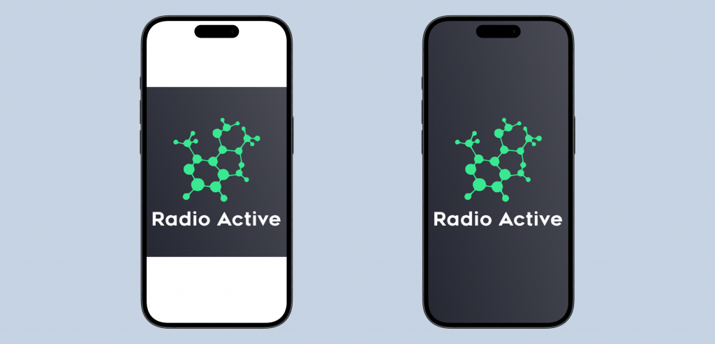
Your app’s default splash screen image might be a square logo, but this often doesn’t look great. Enhance visual appeal by implementing your logo into a vertical background (1242×2208). This gives your splash screen a more polished look and ensures that it fills the screen more effectively, creating a better user experience. A vertical layout allows for more creative freedom and better alignment with the natural orientation of most mobile devices, making your splash screen visually appealing and professional.
Prioritize Readability
Using balanced color combinations that represent your branding while highlighting important information is crucial. A splash screen should be easy on the eyes yet striking enough to grab attention. Free tools like Adobe Color can help you find the best color combinations for your designs, ensuring your splash screen is both attractive and readable. Consider factors like contrast and brightness to make sure your text and logos stand out clearly against the background, providing a seamless and engaging user experience from the moment the app is opened.
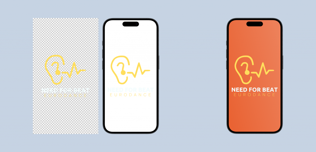
Avoid Transparent Images
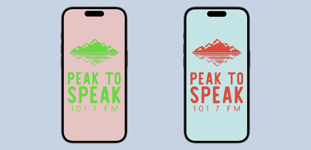
Using a transparent image for your logo isn’t the best practice for splash screens. Transparent images can disrupt color balance and readability, leading to a less cohesive look. Stick to solid backgrounds to maintain clarity and ensure your branding stands out. This approach not only enhances the visual appeal but also ensures that your splash screen maintains its integrity across different devices and screen sizes, giving your app a more professional and polished appearance.
Ditch Low-Resolution JPGs
Keep your branding materials in vector format or as high-quality PNGs. This prevents situations where you need a good-quality image but don’t have one because you’ve been using a low-resolution JPG. High-resolution images make sure your splash screen looks crisp and professional, avoiding any pixelation or blurriness that could detract from your app’s overall appeal. Using high-quality images ensures that every element of your splash screen is sharp and clear, providing a positive first impression for your users.
By following these guidelines, you can create a splash screen that’s visually appealing, effectively branded, and provides a seamless introduction to your app on any device. Remember, the first impression counts – make sure your splash screen represents your app in the best light possible. Our team can help you take your radio app branding to the next level. Become a Pro Plan user today and unlock the full potential of your app’s branding!
